Showing posts with label edit. Show all posts

Fix-it Friday #53


It's Fix-It Friday over at iheartfaces again :) My favorite day of the week to blog because I always know what I'm going to post! Here are my edits for this week. Now it's your turn to head over to iheartfaces and do your own!

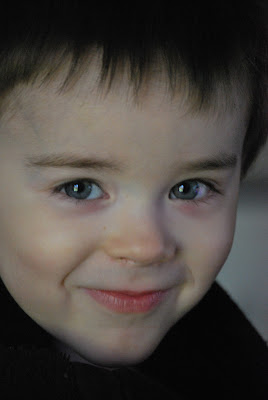
Original:

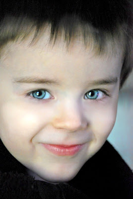
Basic Edit:


Cross Processed Edit:


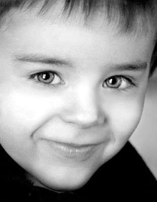
Black and White Edit:


Digital Painting Edit:


Hope you enjoyed these and have a great weekend everyone!


Read more...

Fix-It Friday #50 <--woohoo!

Let me just start off this Fix-It Friday (#50 by the way!) with this: I hate pretty people. There I said it. Especially when they're this pretty as a teenager. Someone tell this girl you're supposed to look awkward! Makes me sick.

Original:
1st edit: Just an overall improvement of the image. Nothing fancy. Just increased the saturation, adjusted the levels to brighten it up, did two types of sharpening filters, and finished up with a warming filter. Then I just cropped it at an angle.


2nd edit: Took what I had already done with the first edit and converted it to grayscale. I had to play with the exposure a little bit to bring back some of the medium tones.


3rd edit: Another digital painting. To learn the process for this edit, click here.


To see more Fix-it Friday edits or to do your own, head over to iheartfaces!

Read more...

Fix-It Friday #49

How disgustingly adorable is this photograph? Seriously...this makes me want to have children just so I can take photos of them looking this cute :)


edit 1

edit 2 (Black & white)


edit 3 (Digital Painting)

Read more...

Fix-It Friday :)


Time again for my new weekly addiction, Fix-it Friday! Since last week was my first time doing this, I decided that this week, I would do a few more edits. And because I forgot to mention last week, I use Photoshop CS3 and a bamboo graphic tablet. Here's the original:Don't know where they find these cuties, but I just love his cheeky grin. This original photo is pretty dark, so I did a levels adjustment to brighten it up overall, but I didn't want to lose too many of those dark tones. There's also not a lot of color, so I did a hue/saturation layer to bring up the cyans and some of the yellows and magentas.....I just realized how long this whole explanation is going to be....ugh. ANYWAY, here's the first edit. Just a basic "fix".
On this second one, I wanted to make it a little more dramatic. So, I turned it into a black and white image, sharpened it (b/c I don't like blurry b&ws), and did a levels adjustment to bring out some contrast. What I didn't mention before is that I went in with the paint brush to put in some highlights. Since it's so dark, there's not a lot of depth in the photo. I used white on the PB set to about 5% and painted some white highlights on his lips, cheeks, eyes, nose, etc...just to give the illusion of some natural light. Then I cropped it with a little rotation.Finally, I did another digital painting. I think I might try to do one of these every week. I know it looks similar to the first one, but I used the smudge tool along with a ton of other tricks to give it a oil-painting effect. Instead of explaining everything here, I might just do a tutorial in another post later if anyone actually wants to learn this whole process.
Soooo, those are my edits for this week. Be sure to head over to iheartfaces.com to learn lots of other tricks and see everyone's great submissions for this week. :)

Read more...

  © Blogger template Shush by Ourblogtemplates.com 2009

Back to TOP